 Based in Arlington, TX. Serving any business, anywhere.
  (901) 490-4750
  contact@uicompass.com

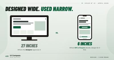
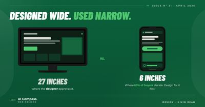
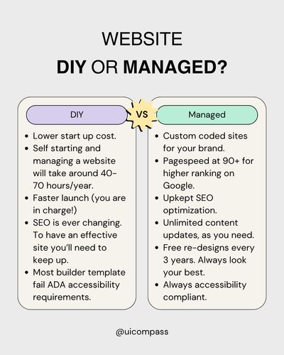
Featured · Performance
Designed on a 27-inch Monitor. Used on a 6-inch Phone.
Around 60% of your visitors are on a phone, but most small business websites are still designed desktop-first and "shrunk" for mobile. How mobile-first web design works, the 5 breakpoints we use on every build, and the 3-rule container pattern that fixes most layout bugs.
Read the article