 Based in Arlington, TX. Serving any business, anywhere.
  (901) 490-4750
  contact@uicompass.com
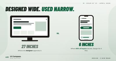
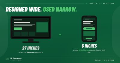
Around 60% of the people visiting your website right now are doing it from a phone. Most small business websites are still designed on a 27-inch monitor and "made responsive" afterwards.
That gap is structural, not a styling problem. A website designed at desktop size and then shrunken down for phones is a different product than one designed at phone size and expanded up to desktop. The first one breaks somewhere between 400 and 768 pixels. The second one almost never does.
What "mobile-first" web design means
Mobile-first does not mean the mobile version ships first. It means the mobile layout is the first thing the developer writes in code. The desktop layout is built on top of it.
In CSS terms, the difference is the direction of the media queries:
- Mobile-first: Start with the 320-pixel phone layout. Use
min-widthqueries to add tablet, laptop, and desktop layouts on top. - Desktop-first: Start with the desktop layout. Use
max-widthqueries to strip it down for smaller screens.
Both can technically work. Only one produces sites that look right on the phone the visitor is actually holding.
Why mobile-first wins and desktop-first breaks
Designing for a 320-pixel screen has almost no decisions to make. One column. Big headlines. Wide buttons. Images stretch edge to edge. You write the content in the order it should appear and let it stack.
Then as the screen gets wider, you decide where to add a second column, where to use a horizontal layout, where to make the headline larger. Each breakpoint adds one decision on top of the last one. The mobile layout never breaks because you never break it.
Desktop-first goes the other direction. Three columns at 1280 pixels need to collapse to two at 1024, one at 768, and a different one at 400. Each breakpoint is a decision about what to take away. Each removal is a chance to introduce a bug that did not exist on the device the designer was looking at.
The math favors mobile-first. Decisions get added rather than removed. New content slots into existing rules instead of breaking them.
Start at 320 pixels
The smallest phone we still design for is 320 pixels wide. That is the iPhone 5SE, still in active use by enough people to matter — particularly older customers, overseas visitors, and accessibility users running 200% browser zoom.
If your site renders correctly at 320 pixels, it renders correctly on every phone shipping in 2026.
The 320-pixel layout is the discipline. Anything that does not fit at 320 should not be there:
- Long marketing headlines that wrap into four lines
- Two-line navigation menus
- Buttons that need precise tapping
- Hero text overlaid on a busy image without a contrast layer
They are all the same problem, and they all get caught at the smallest screen.
The 5 breakpoints we use on every small business website
We do not add a breakpoint because the design "needs one." We use the same five on every site we ship. They cover the range of devices that actually exist and resist the temptation to micro-tune for an iPad in landscape mode that no customer is actually using to find your business.
400 pixels
The phone-to-phablet transition. Body text gets a touch more generous. Hero images can breathe slightly.
568 pixels
Larger phones rotated to landscape mode and small tablets in portrait.
768 pixels
The first real two-column layout. Tablets and the smallest laptops.
1024 pixels
Standard tablet landscape and entry-level laptops. The navigation can spread out. Most pages can fit a third column if they need one.
1300 pixels
Standard desktop. The hero gets its full real estate. Content gets a max-width cap so the line length does not stretch past 90 characters on a 32-inch monitor.
Five breakpoints, hand-picked. Page builder sites we audit routinely have 8 to 12 breakpoints, most of them set automatically by the platform and overlapping each other in ways nobody can explain.
Containers fix the rest
Most layout problems on a small business website are container problems. Content stretches edge to edge on big monitors, or jams together on a phone.
A container is a wrapper around your content with three rules:
- Full width
- A
max-widthcap (usually around 80rem / 1280 pixels) margin: 0 autoto center it
That is the entire pattern. Apply it to every section of the page and the layout will look right at every screen size.
Without it, body text on desktop runs past 90 characters per line and feels uncomfortable to read. With it, the same content reads well at 320 pixels and at 1900. One CSS rule per page section.
This is the same container pattern that holds together our seven-section homepage layout at every width.
Where page builders get this wrong
Most page builders default to a desktop-first layout because the designer is editing on a desktop. The mobile view is then "automatically generated", which is a polite way of saying "shrunken until it fits."
The result is a phone experience that has the same elements as the desktop version, but in the wrong sizes, the wrong order, and with the wrong amount of breathing room. Three call-to-action buttons above the fold on desktop become three tiny stacked CTAs on a phone, none of them easy to tap without zooming.
You can fix this on a builder. It just takes more work than starting from a mobile-first hand-coded base, because every fix is fighting the platform's defaults instead of building on them. The same logic applies to PageSpeed scores. Builder defaults work against you on both mobile layout and load time.
How to tell if your site is desktop-first
Open your site on the phone you are holding right now. Then do three things:
- Tap the top button or main call-to-action. Did your thumb hit it on the first try, or did you have to zoom in?
- Try to fill out the contact form. Are the input fields wide enough? Does the keyboard cover the submit button?
- Read a paragraph of body copy without zooming. Is the text at a comfortable reading size, or do you have to pinch to enlarge?
If any of those felt off, the gap between the desktop your site was designed on and the phone your visitors are using is showing.
The fix depends on how bad it is. Sometimes it is a focused redesign of the mobile layout. Sometimes it is a full rebuild on a foundation that is not fighting you. The decision tree for that call is in our redesign-or-optimize scoreboard.
We hand-code every site mobile-first as part of every web design and web development build. The 320-pixel layout is the first thing in the stylesheet. Our pricing folds ongoing mobile-layout maintenance into the same monthly fee as everything else.
If you want a fix without a rebuild, send us your URL and we will tell you whether the mobile layout is salvageable.
Frequently asked questions
What is wrong with designing a website desktop-first?
Each desktop-first breakpoint is a decision about what to take away. Three columns at 1280 pixels need to become two at 1024, one at 768, and a different one at 400. Every removal is a chance to introduce a bug. Mobile-first goes the other direction. Decisions get added rather than removed, so the mobile layout is never broken because you never broke it.
Do I really need to design at 320 pixels? Nobody uses an iPhone 5SE anymore.
Older customers, overseas visitors, and accessibility users running 200% browser zoom all collapse to roughly 320 pixel viewports. The same layout that works at 320 also works on a tablet rotated to portrait with a sidebar open, which is more common than people think. Designing for 320 is the discipline. The actual visitors at 320 are a smaller bonus.
How do I test on actual phones, not just browser dev tools?
Three options. Free: borrow phones from family or coworkers and load the site over their cellular data, not your office Wi-Fi. Cheap: BrowserStack or LambdaTest give you 100+ real devices on demand for $20–40/month. What we use on every build: a small device library (3 phones, 1 tablet) plus BrowserStack for edge cases. The PageSpeed scores Google grades you on are run on a simulated mid-range Android, so testing on a flagship iPhone alone is misleading.
Are five breakpoints enough for every small business website?
For a small business site, yes. We have shipped well over a hundred sites on the same five breakpoints. The cases that need more are rare. Complex web apps with dense data tables. E-commerce sites with very tight product grid requirements. Sites that need to support specific tablet form factors like kiosks or in-vehicle displays. For a homepage, services pages, blog, and contact form, five is plenty.
What if my customers are mostly desktop users? Do I still need mobile-first?
Yes, for two reasons. First, "mostly desktop" usually means 70/30, not 95/5. The 30% is still real money. Second, Google indexes your site mobile-first regardless of who visits. A site that fails on mobile fails in SEO too, even if no actual customer ever loads it on a phone.
Can I fix mobile-first on my existing page builder site?
Partially. You can usually customize the mobile layout, override default breakpoints, and resize images for phones. What you cannot do is change the underlying CSS architecture — the builder generates desktop-first stylesheets, and your overrides fight that on every page. If your mobile experience has more than two of the warning signs in our redesign scoreboard, the right answer is usually a rebuild.
Why does my mobile layout break between phone and tablet (around 600–768 pixels)?
That range is where most "responsive" templates collapse. Mobile rules apply, desktop rules apply, but neither was written for the in-between. Page builders often jam an "iPad portrait" view in there as an afterthought. Hand-coded sites with the five breakpoints we use treat 568 and 768 as named transition points, so the layout is intentional at every width.